
Markets and Economy Update – Bolstered by Blue Chips
Prior to the Major League Baseball (MLB) All-Star break, my brother and I will be taking our eldest children to their first MLB game at Citizens Bank Park in Philadelphia. My son (6) and my niece (8) have both grown into absolute sports nuts, especially when it comes to baseball, so this is bound to be a memorable experience for each of us. After all, as of this writing, our beloved Phillies happen to possess the league’s best overall record, which makes rooting for the team quite a bit more enjoyable. In fact, I sometimes wonder if my son would be so glued to each game if the Phillies were the sub-500 team of my youth who missed the postseason year-after-year-after-year.
With some professional sports, league owners and commissioners seek ‘parity’. For example, parity is often a word used in National Football League (NFL) circles. In NFL terms, parity means that there is less distance between the ‘haves’ and the ‘have-nots’ and, in any given year, just about any team has the resources and ability to compete at a high level and potentially make the postseason. This helps generate perpetual excitement across the league’s fanbase.
On the other hand, when it comes to the MLB, parity is an afterthought. There is a clear delineation between the haves and the have-nots, and the quality of a team’s lineup tends to correspond to the size of a team’s media market, with areas like New York (Yankees/Mets), Los Angeles (Dodgers/Angels), Texas (Rangers/Astros), and Philadelphia (Phillies) typically having the largest team payrolls in the league. More often than not, if you can acquire the best players, you can field the most competitive team, and these big-market teams seem to carry the weight of the entire league.
We’re seeing very similar dynamics in financial markets these days, where a select few mega cap companies are carrying the stock market consistently to new highs. What the Yankees, Red Sox, and Dodgers are to Major League Baseball, companies like Amazon, Microsoft, and Apple are to the stock market. These organizations are the blue chips. They are the mega caps and, right now, when it comes to the U.S. stock market, they have been carrying the entire S&P 500 since early 2023.
So, in this month’s letter, we’ll discuss some of the dynamics around the stock market’s ‘haves and have-nots’ while reviewing the prospects of a Fed rate cut in the third quarter of 2024.
Bolstered by Blue Chips
In the investing world, we often refer to large, established companies with strong track records of growth and financial stability as ‘blue chips’. Back in the day, stocks like AT&T, General Motors or U.S. Steel would’ve been perfect examples of blue chips. Where does this term come from? Well, apparently, it was coined by Wall Street investors in the early 1920’s because, at the time, the highest-value poker chips were the color blue. So, the term ‘blue chip’ was subsequently used to refer to the high quality, high value companies on the stock market. Tuck that little factoid away for the next time you’re watching Jeopardy.
There have always been blue chip stocks that have contributed to overall market performance as measured by the S&P 500 index. We’ve reviewed this dynamic in previous investor letters and webinars. However, what’s unique is that the S&P 500 continues to reach new highs, yet the rally is so concentrated among a select few stocks.
This is clearly detailed in the chart below that illustrates the performance of the 7 largest S&P 500 stocks (aka – The Magnificent 7: Microsoft, Apple, Amazon, Meta, NVIDIA, Tesla and Alphabet) vs. the remaining 493 companies in the index. As you can see, in 2023, the top 7 stocks had a combined return of +76% vs. just +8% for the remaining 493 stocks in the index. That theme has continued thus far in 2024 as the top 7 stocks have returned +40% as-of this writing vs. only +6% for the rest of the index.
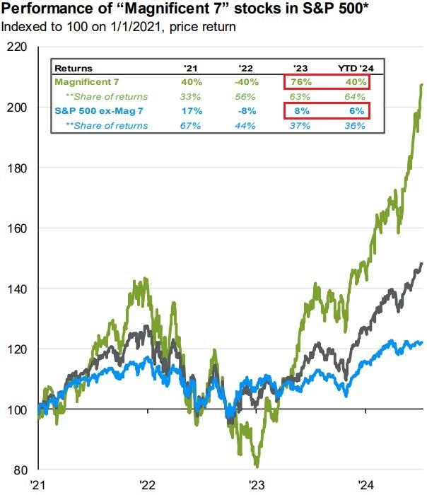
Source: JP Morgan Asset Management – Guide to the Markets
As a reminder, the S&P 500 is a market cap weighted index. A company’s market cap is derived by multiplying its stock price by the number of shares outstanding. So, as a company’s stock price increases, its market cap increases. As its market cap increases, it can become a larger and larger constituent of the overall S&P 500 index. This is illustrated in the chart below. As the prices of the largest S&P 500 companies continue to ascend, they subsequently account for more and more of the overall index. As of July 8th, the top 10 stocks accounted for 38.2% of the overall index – this is, by far, the largest concentration in modern history.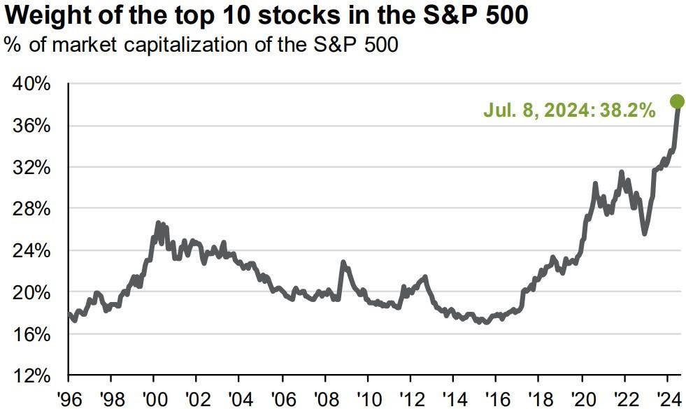
Source: JP Morgan Asset Management – Guide to the Markets
One risk we track for investors is concentration risk. For example, a client may have a large portion of their portfolio allocated to stock of the current or former employer due to incentive packages and such. Therefore, over time, we typically try to diversify that concentrated risk so that the entire portfolio isn’t entirely tied to the performance of a single stock.
We’ve seen concentration risk increase over the past few years in the S&P 500 as the stocks of the largest companies continue to ascend. This has trickled into investor portfolios, as a fully diversified portfolio with a 60% allocation to equities (stocks) might now have a 3-4% allocation to Microsoft, 3%-4% to Apple, 2.5%-3.5% to NVIDIA, 1.5%-2.5% to Amazon, and so forth. Keep in mind, these are percentages of an entire portfolio, not just of the equity portion. So, a diversified portfolio with a 60% equity allocation might have, on the high-end, 18%-20% allocated to these top 10 stocks. Clearly, that’s been extremely beneficial over the past 18 months and we’ve sought to allocate heavily to these high-growth mega cap stocks, but it’s an element of this unique market that we’re watching closely.
Struggles in Small Caps
As I’ve intimated previously, there is very little parity across asset classes, and there’s been a clear distinction between haves and have-nots. To illustrate this, we only have to look at how small caps have performed relative to large caps since the interest rate cut cycle began in early 2022. By definition, small caps are smaller, publicly traded companies with a market cap of $250 million to $2 billion. Compare that to Apple, who has $67 billion of cash on hand.
Regardless of size, small caps have been strong contributors to diversified portfolios over the past 15 years. In fact, since 2009, small caps are the #2 ranked asset class in terms of performance with an annualized return of +11.3%. Small caps also happen to be the most volatile asset class over that same time period with annualized volatility (standard deviation) of 21.9%.
However, seldom do we see such a pronounced spread between the returns of large cap and small cap stocks. While they don’t necessarily move in exact lock-step, large and small cap stocks have historically been highly correlated, meaning that if large caps ascend, small caps tend to ascend to a lesser or greater degree. The same can be said on the downside.
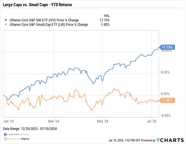
What’s unique in 2024 is that large caps, as measured by the iShares S&P 500 ETF (IVV), are up 17% year-to-date, while small caps, as measured by the iShares Small Cap ETF (IJR), are still down -1.85% year-to-date. This data is illustrated in the chart below.
The last time we saw such a spread in the performance of large caps and small caps began around 1998 and the years that led up to the Dot Com Bubble, as seen in the chart below.
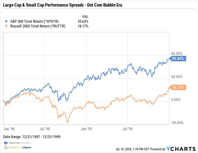
Now, I’m not necessarily drawing comparisons between the Dot Com bubble and today’s stock market. NVIDIA is not Pets.com. Markets are currently buoyed by companies with extraordinary revenues and profits, and not by companies with revenues/profits that either didn’t exist, or that didn’t come close to justifying their exorbitant valuations.
The recent struggles in small caps is somewhat understandable, particularly when it comes to current interest rate policy. As I mentioned earlier, Apple is sitting on an enormous pile of cash and can virtually self-fund any growth initiatives. On the other hand, small caps tend to run light on cash and are in a stage in their corporate life cycle where they may need to issue debt or finance growth through lending. With interest rates as elevated as they are, this becomes an expensive proposition, particularly on the heels of the ‘free money’ era where rates have been so low for so long. In short, it’s becoming harder and harder for companies to pay interest on its outstanding debt.
This can be seen in the chart below that shows the interest rate coverage ratios for Large (Grey), Mid (Green) and Small (Blue) cap U.S. companies. The interest rate coverage ratio divides a company’s earnings before interest and taxes (EBIT) and divides it by its interest expense over a given period. Lenders typically at least want to see an interest rate coverage ratio or 2x and, as you can see below, small caps have dipped below that 2x mark in recent months.
Interest Rate Coverage Ratios – Large Caps (Grey), Mid Caps (Green), Small Caps (Blue)
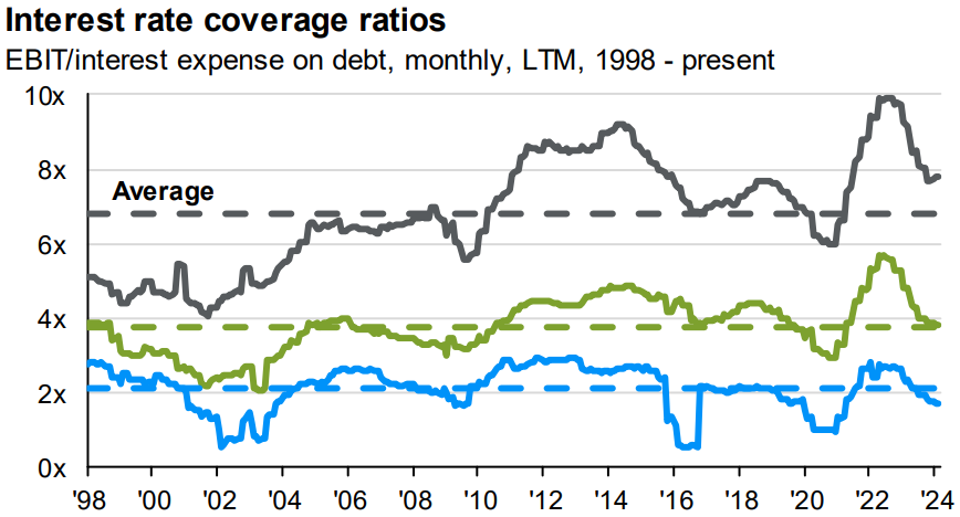
Source: JP Morgan Asset Management – Guide to the Markets
We are also seeing a trend develop where small companies may be staying private and deciding not to IPO (initial public offering – aka ‘going public’). Historically, an IPO was a form of significant shareholder liquidity (i.e. a big payday for founders & pre-IPO shareholders). However, as private equity markets have significantly expanded in recent decades, if a company decides to IPO, it may do so at a much more mature stage of it’s corporate life cycle.
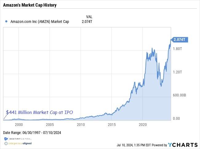
Think about Amazon vs. Space X as examples of this changing dynamic. When Amazon first IPO’ed back in 1997, it did so with a market cap of just over $441 million. Today, it is worth $2.07 trillion dollars, as you can see in the extraordinary chart below.
Conversely, Elon Musk’s space technology company, Space X, is expected to IPO over the next year or two, and is currently expected to command a valuation of roughly $200 billion. That would immediately make Space X the 37th largest company in the S&P 500 with a market cap higher than names like Cisco, McDonalds, General Electric, and many more. In short, investors can’t participate in an Amazon-like ride as the company grows over the course of a few decades.
Do we expect small caps to consistently remain as a ‘have not’ relative to other asset key asset classes? The short answer is ‘no’. We’ll talk about interest rate policy next, but we expect rates to fall, and this will begin to ease the financial pressure on smaller companies and should, in turn, boost growth. There are many amazing small corporations represented in the stock market, and they absolutely warrant a measured, yet meaningful, allocation within a diversified portfolio.
Are Rate Cuts Finally In Sight?
To close this month’s letter, we’ll review some of the emerging data that suggests a Fed rate cut may be in-play during the September Federal Open Market Committee (FOMC) meeting. First, we’ve seen recent inflation reports emerge that suggest that inflation may be on the eventual path back to the Fed target. In fact, on July 11th, the Bureau of Labor Statistics (BLS) reported Headline CPI of 3.0% and Core CPI of 3.3%. Both readings were better than the consensus estimates of 3.1% for Headline and 3.4% for Core. Both investors and the Fed can breathe a little easier with a report like that.
I should also note that when the Fed is talking about its 2% inflation target, it’s referring to the Core PCE (Personal Consumption Expenditure) reading, not CPI. When referring to inflation in terms of Core PCE, we’re not too far off from target levels, as you can see below. 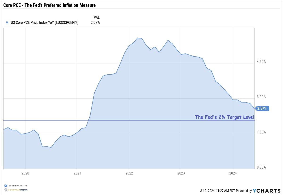
According to the Cleveland Fed, core PCE is expected to fall to roughly 2.4% in June, so we’ll be watching the next PCE release on July 26th very closely.
We are also seeing some softening in the labor market in recent months, and you can be sure that the FOMC is keeping a keen eye on this data. After all, the Fed has a mandate to deliver both stable prices and full employment. Like many charts you see in these letters, the chart below is a custom creation of mine that helps to show the ‘Employment Situation’ across four key areas: the unemployment rate, monthly job gains, total job openings, and wage growth.
As you can see below, we’re starting to see some softening in the labor market with the unemployment rate rising to 4.10% after being at the sub 4% level since March of 2022. Furthermore, month-over-month payroll gains are down a bit relative to recent averages, total job openings continue to decline, and wage growth continues to descend back towards the long-term average of roughly 3.5%.
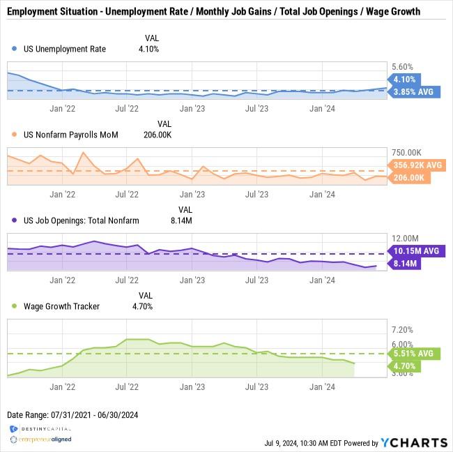
Generally speaking, the labor market still shows some strength, but is on less solid footing than it was 3, 6 or 12 months ago. This can be a slippery and treacherous slope, and the Fed doesn’t want negative momentum to build in the labor market that suddenly causes a spike in unemployment to 5.0% or higher. They can potentially avoid this through effectively managing interest rate policy as the economy navigates this final descent to 2% year-over-year inflation.
Due to progress on inflation and softening in the labor market, investors are now placing an 84.6% probability on a 0.25% rate cut during the Fed’s meeting on September 18th. 8.1% of investors see the potential for a 0.50% rate cut. This means that investors now see a roughly 93% chance that some kind of rate cut will emerge in September, as you can see in the chart below from the CME Group’s FedWatch tool.
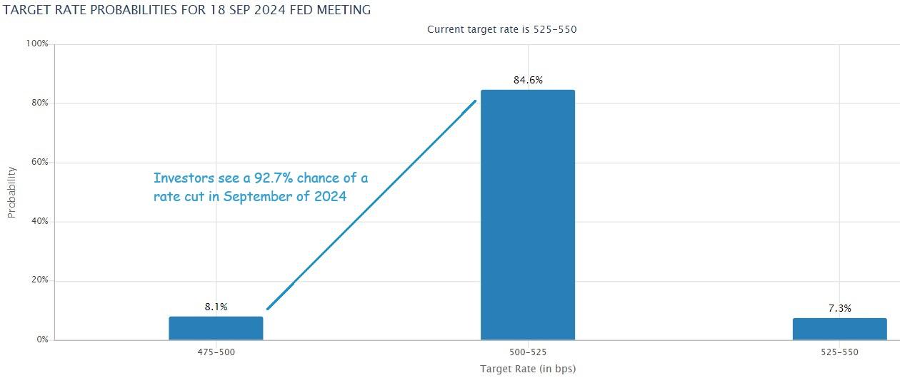 Source: CME Group FedWatch Tool
When it comes to Fed policy, I take a ‘fool me 10 times, shame on me’ philosophy around interest rate predictions. For many months, the Fed has hinted that interest rate cuts could be on the horizon, only to shift gears time after time. This has led to greater uncertainty for investors, as interest rate policy is an essential variable when making asset allocation decisions. Fortunately, at this stage, we see very little interest rate risk in our investor portfolios, and they are tactically allocated to potentially benefit from a decline in interest rates, whenever that may happen.
Looking for more insights on current economic trends? Check out our last Markets and Economy Update: “The Election, Debt & Social Security.” In this article, Tim Doyle, our CIO, examines the potential economic impacts of election outcomes, national debt concerns, and the future of Social Security. Read it here to gain valuable perspectives on these critical issues and understand their potential effects on your investment strategy.
Important note and disclosure: This article is intended to be informational in nature; it should not be used as the basis for investment decisions. You should seek the advice of an investment professional who understands your particular situation before making any decisions. Investments are subject to risks, including loss of principal. Past returns are not indicative of future results. Advisory services provided by Destiny Capital Corporation, a registered investment adviser.
2024 YCharts, Inc. All Rights Reserved. YCharts, Inc. (“YCharts’) is not registered with the U.S. Securities and Exchange Commission (or with the securities regulatory authority or body of any state or any other jurisdiction) as an investment adviser, broker-dealer or in any other capacity, and does not purport to provide investment advice or make investment recommendations. This report has been generated using data manually input by the creator of this report combined with data and calculations from YCharts.com and is intended solely to assist you or your investment or other adviser(s) in conducting investment research. You should not construe this report as an offer to buy or sell, as a solicitation of an offer to buy or see, or as a recommendation to buy, sell, hold or trade, any security or other financial instrument. THE IMPORTANT DISCLOSURES FOUND AT THE END OF THIS REPORT (WHICH INCLUDE DEFINITIONS OF CERTAIN TERMS USED IN THIS REPORT) ARE AN INTEGRAL PART OF THIS REPORT AND MUST BE READ IN CONJUNCTION WITH YOUR REVIEW OF THIS REPORT. Disclosure – YCharts
Share this
Stay Ahead with Smart Investments
Learn how to invest wisely and minimize risks to protect your retirement savings.

Achieve Your Retirement Goals
Get personalized advice to meet your retirement goals. Book your call with Destiny Capital now.